Design for Accessibility
Jensen Laatsch | June 15th, 2020
Perceivable, Operable, Understandable, Robust
As designers, we need to make sure that the things we make can be used by as many people as possible and that the experience is pleasant and intuitive. We need to do more than the minimum and actually promote design that is inclusive of, and useful to, everyone. To accomplish this, we need to make sure we are designing thoughtfully and carefully.
I’ll focus on w3.org’s Web Content Accessibility Guidelines. The four principles of WCAG (2.1) are Perceivable, Operable, Understandable, and Robust. Most of my focus will be on providing a bird’s eye view of perceivability — making sure that the content and interface are readable, listenable, and viewable by the most people possible.
Non-Text Content
Any time a piece of content is displayed to the user it must have a text alternative or be accompanied by supporting text. Most of the time this should be delivered as alternate text on images. Alternate text will allow people to better understand images or illustration-based content — this is especially important when some users require screen readers to translate content to them in non-visual formats. Providing supporting or alternate text is one of the most important ways to deliver content and is a huge step in the right direction. This should always be kept in mind.
Here are some practical examples of supporting or alternate text. Notice that one of these examples will technically pass, as it does offer alternate text and a very basic definition of the image, but this is not what we are really looking to achieve. Ideally, there would be a complete description of the image so that a person can have as much detail as possible even if they lack the ability to see the image.
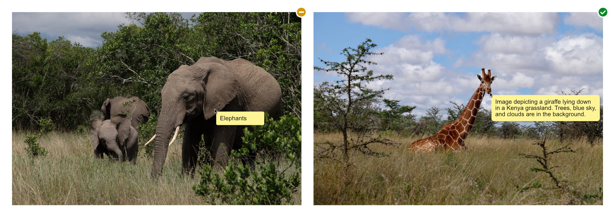
Two images, one with a generic description — elephant — the other with more descriptive text — Image depicting a giraffe laying down in a Kenya grassland. Trees, blue sky, and clouds are in the background.
Use of Color
Make sure that color is not the only differentiator between important items. This includes anything that would indicate an action, mark a visual element on a page, or require response from a user. This helps people with vision impairments tell visual items apart from one another.
In my graphic you’ll see an example that might come up in everyday web browsing. This is a pretty common one. You’ll see a shop listing where the color picker might be difficult for some users and how to remedy that. In the good example, I chose to list things in a clear and easy drop-down where each color has a corresponding label.
Exceptions to this rule would be when design items or elements are purely for decoration.
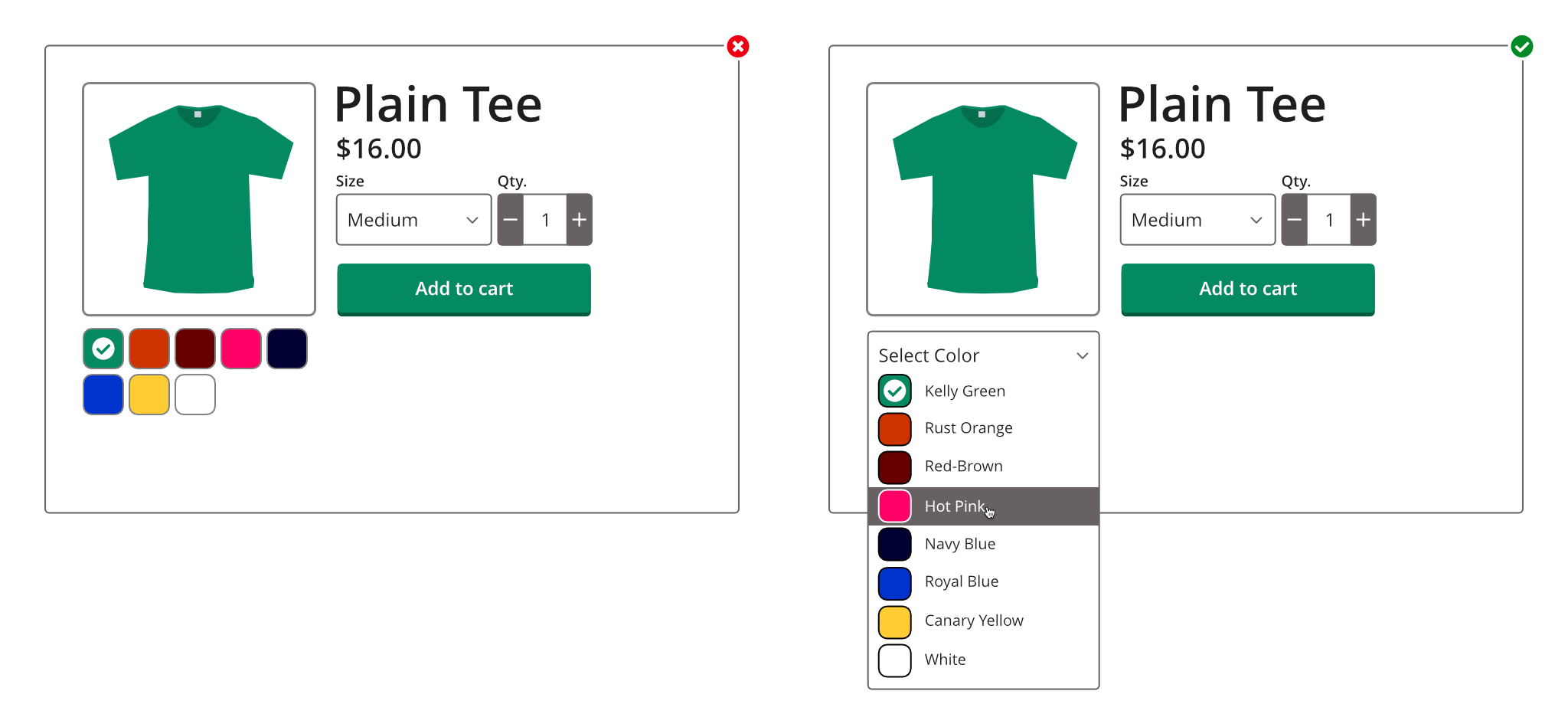
Two images, first image is a shop site screen grab of a green t-shirt. Additional t-shirt colors are shown below in square colored blocks. The second image is similar, except the colors also have the text names next to them.
Contrast Minimums
This is a really important part of designing for accessibility, and usually the most common issue I have to solve day-to-day. Always make sure that you are providing proper contrast between controls, their content/text, and the background behind them. I don’t believe that it is explicitly stated, but it’s also a good practice to include icons that perform a function in this ruleset.
WCAG’s exact guidelines for AA compliance:
- Text must have a contrast ratio of 4.5:1.
- Large text must have a contrast ratio of 3:1.
- Incidental, inactive, invisible, or purely decorative text has no minimum contrast requirement.
- Text that is part of a logo or brand image has no minimum requirement.
I’ll provide a few good and bad examples of this — hopefully illustrating how to best design for contrast requirements. A good rule to follow is, make sure that anything you can interact with will stand out against its surrounding or background. If I were to design a button, I’d have to make sure that button is properly contrasted against the background of the page (or whatever is behind it) and the text or icon on the button also has proper contrast against the button itself. There are some hugely helpful tools to quickly check for issues like this. One I use every day is colourcontrast.cc for quick checks. It’s great.
In my examples you’ll see that two of the buttons fail, and two pass. The leftmost button fails because the button itself fails to meet contrast requirements against the white background and the text fails because it does not meet requirements on top of the button. The middle-left fails because only some of the button surface passes. This is something to look out for when creating gradients. The last two both pass because they meet all the AA contrast requirements for both button-on-background and text-on-button.
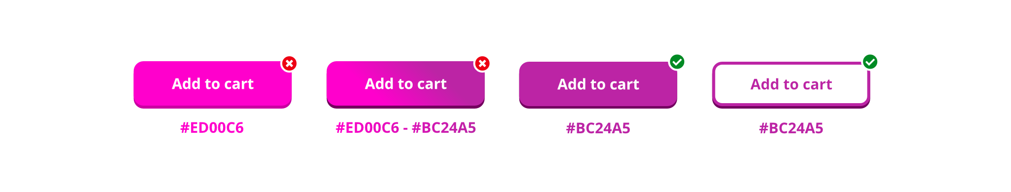
Four different button examples. First is a hot pink button with white text, second is a gradient colored button — hot pink / purple with white text, third is a purple button with white text, and fourth is a white button with purple text and purple outline.
Extra resources
I’ve barely scratched the surface of this subject, but hopefully this can be a starting point for anyone new to designing for disabilities — or design in general. Here are some extra tips and services to help out with some more specific topics.
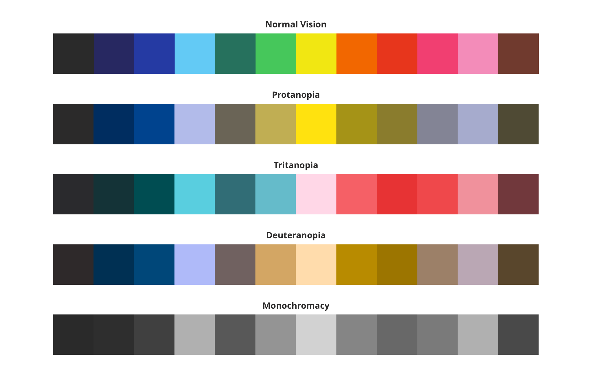
Colorblindness
This one is pretty common and there are a few types to be mindful of. Toptal has a great website checker here to help make sure that you aren’t missing anything. Here are some of the common types of colorblindness and an approximation of what they look like to those affected.

Examples of different color blindness and how colors are perceived. Normal vision, Protanopia, Tritanopia, Deuteranopia and Monochromacy.
Keep colorblindness in mind when designing key functions on sites or apps. It’s definitely possible to create something that might not be visible to some users.
Some design tools offer colorblind filters to allow designers to see things displayed as they’d be seen to a person with colorblindness in real-time. It all depends on the app you’re using. Photoshop has one under View->Proof Setup->Color Blindness, but Sketch does not. For the ones that don’t, use a checker like Toptal’s tool linked above.
Dyslexia
This is another pretty common one. Generally using a sans-serif font with less crowding will help people with dyslexia read content on your designs. But if you find yourself designing specifically for those with dyslexia, consider using Comic Sans, or a font designed specific to that purpose. People rip on Comic Sans all the time, but it is actually one of the better options for catering to that specific disability. The irregular and almost unpredictable lines make it more difficult for a person’s eyes to assume the shapes and it prevents the eyes from jumping around so much. Less uniformity is better for people with dyslexia.
Another great resource for this is the font Dyslexie. It’s a purpose-built font from someone who has dyslexia themselves.
In general, allow more letter spacing and crowd your words and letters less. Allow for a little extra line-height as well and you should be on the right track for this. Another good tip is to avoid movement or animations and to use clear, simple graphics if you need to use imagery in your designs.
Some great resources for designing for dyslexia:
- Comic Sans
- Dyslexia Font — dyslexiefont.com
- OpenDyslexic — opendyslexic.org
- Sylexiad — sylexiad.com
Bonus Round:
Here are a couple extra resources to help design for disabilities.
- Audioeye — a great tool to help check for errors or specific gaps in accessibility in real time on the web audioeye.com
- AccessiBe — Another great checking tool ace.accessibe.com
- WAVE tools — an open source alternative to the two checkers above wave.webaim.com
- W3.org’s huge list of accessibility tools https://www.w3.org/WAI/ER/tools/
- W3.org’s Quick Reference for WCAG
- https://www.section508.gov/
That’s it for now. Check out all the resources I’ve listed and go scour the internet for more, because there are plenty of places to find way more information.
Let’s go make something cool!