Designing an Online System
Jessica Esplin | April 8th, 2020
Cultivating an online presence is both a necessity and a complete mystery to most small businesses today. They know that they need to show up at the top of a Google search, but have no clue how make that happen, let alone how to manage multiple social media channels. Outsourcing their marketing concerns to an expert is a tempting proposition. RevLocal realized this opportunity ten years ago and has been at the forefront of online marketing ever since.
Until recently, the RevLocal team member assigned to your account would do everything for you, but they’ve found that their process can be inefficient if their clients aren’t engaged enough with their “strategist,” whether it be not responding to emails, forgetting to update their business hours, etc.
RevLocal engaged with us at AWH to create a digital platform to increase client retention by giving their clients something tangible to interact with. Their plan is to transition from a “do it for you” to a “do it with you” business model in the next few years and they decided that they’d like outside help in making their product as user friendly and technically sound as possible. As the designer for this project, I was excited to dive in.
Research
Starting out, we had a few meetings with the RevLocal team to get a feel for what they had in mind for the online system and what their concerns were. There was a steep learning curve for the AWH team when it came to their current products, vocabulary and processes. They’ve been around for a while and have 500+ employees so there was a lot of information that we needed to download quickly in order to design and build a solution with as much context as possible.
On the technical side, there were dozens of complex questions that needed to be answered but on the design side, we really needed to understand the thoughts and workflows of both their employees and their clients.
This need to make informed, user-centric decisions led us to conducting interviews with RevLocal employees from various roles and levels as well as RevLocal clients. The interviewing process was critical in the creation of a valuable product and both the Product Manager and I sat in on all of these. From there, user personas were created along with a list of desired features for this new product.
Feature Selection
The feature list consisted of functionality that RevLocal as a business wanted included and those things that their clients expressed an interest or need in. Where these two needs overlapped is where we got our phase 1 feature list from. After running it by the RevLocal team, we were ready to start prioritizing and ideating with them.
Feature Goals
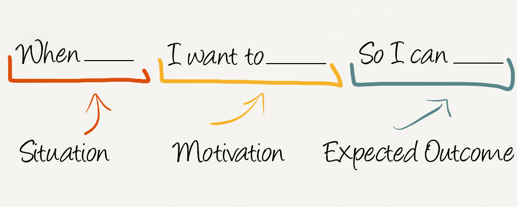
I then created job stories for each of the features we decided we wanted included.
This allowed us to have some insight into what a user might want to accomplish while interacting with it, along with the motivation behind the action (which I gathered from our research phase).
User Flows
Throughout the length of the project, after I created the job stories for a particular feature, we moved onto architectural flows. This was a key step because it was also the beginning of the development team’s interaction with that feature.
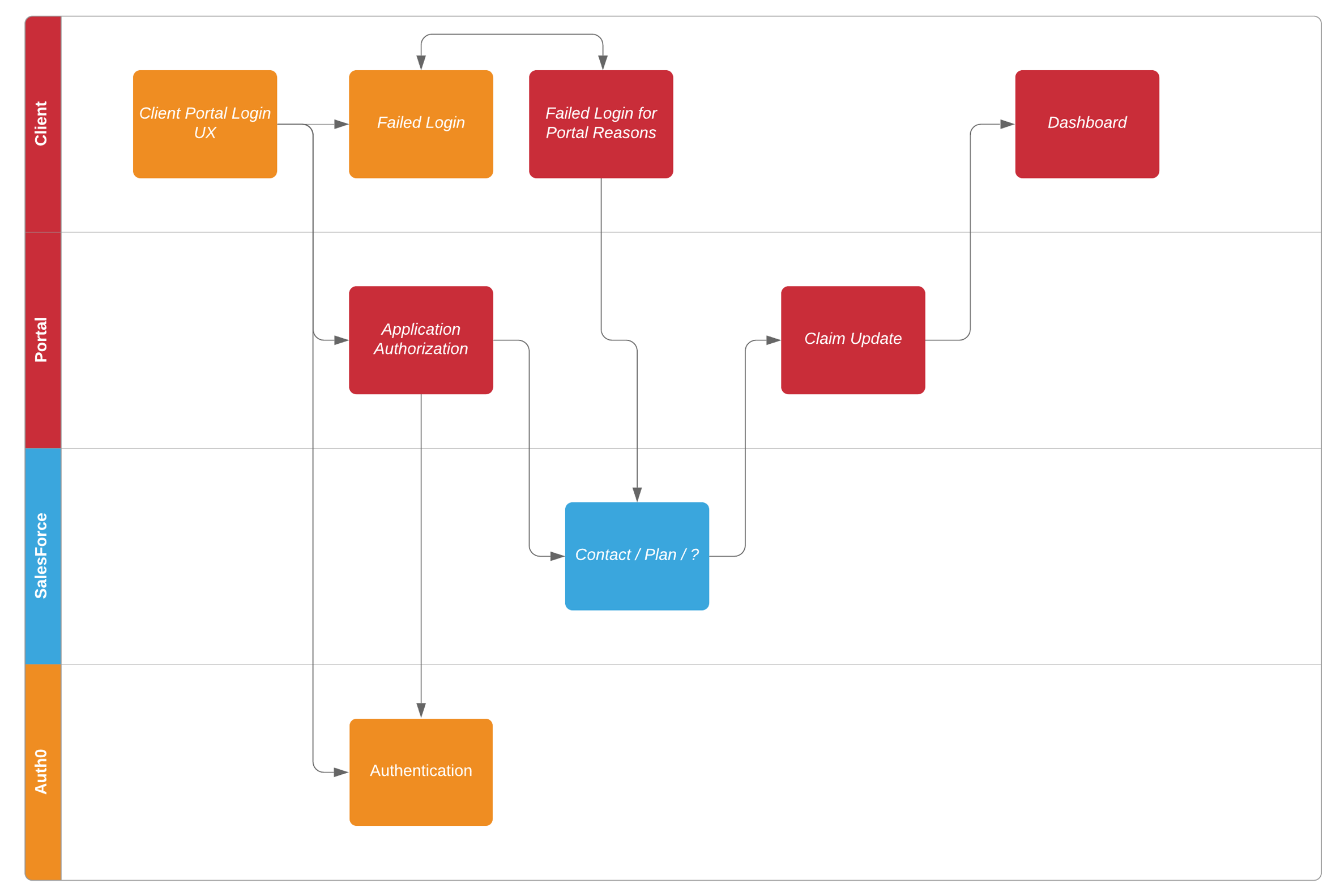
As you can see from the example above, creating the architectural flows allows the product manager and team lead to map expected user flows to technical implementation details.
This was especially key for this project since RevLocal uses Salesforce and we needed to interact with their API for our online product. Mapping it out in this way allowed everyone to have a general idea of how a feature would exist before we started breaking it out into tasks to be completed.
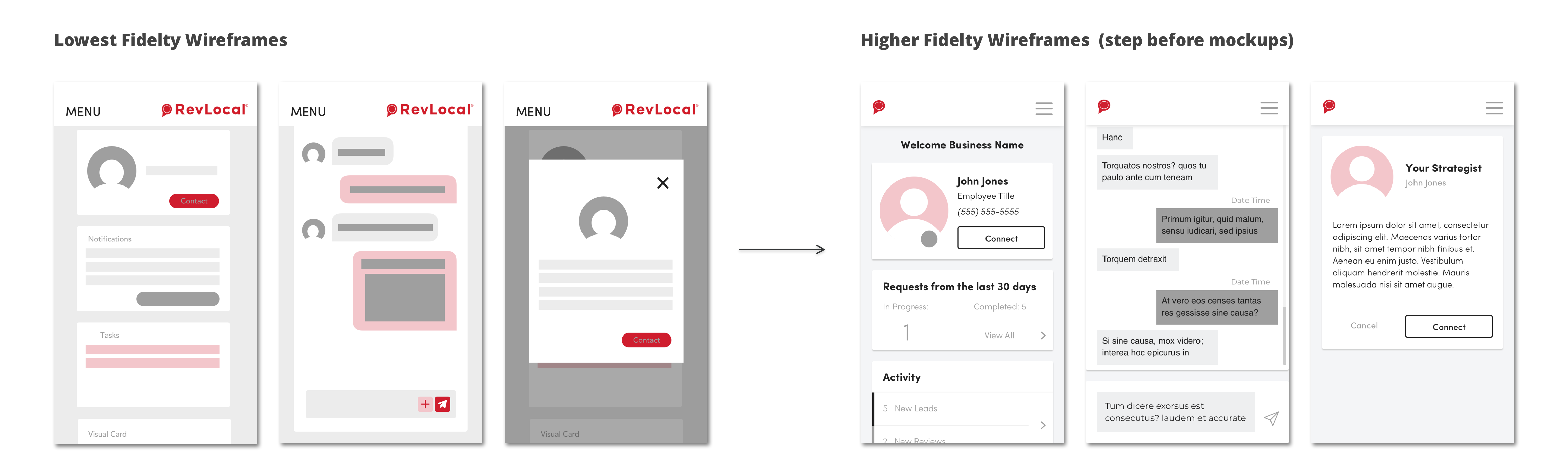
Wireframing
Once I had tons (and I mean TONS) of sketches, it was time to start narrowing them down to a couple good options and test them out.
Wireframes are a grayscale version of how a screen might look. These allows us to not be distracted by the exciting user interface decisions like button colors or shadow amounts, and instead focus on where elements should be placed in order for them to be as frictionless as possible for a user trying to complete a certain task.
While wireframing, I would often refer back to user research and validate my choices. This meant reacquainting myself with the specifics of the feature from the interviews and reading through others’ research and testing on UX best practices.
Each different feature had a slew of usability and business concerns to balance. For example, when I was designing the homepage, here’s a sample of the foundational concerns I had to keep in mind.
- A homepage for a product like this cannot be cluttered. If a user sees too much on an initial page, they’re likely to give up on their task in mind.
- Because RevLocal wanted to increase user retention, they somehow needed to casually show their clients the value the system was providing.
- We needed to illustrate that value as much as possible on the home page because users are unlikely to click onto a different page that isn’t related to one of their tasks they want to complete.
- We needed a way to cohesively organize the many things we wanted on this page.
- It needed to be responsive and “feel” like a native app while on a mobile device.
- RevLocal wanted to preserve the user’s connection with their strategist (the employee assigned to working with them personally).
- We needed to be able to add or take away content on the homepage as we moved on from phase 1.
- It needed to be consistent with the rest of RevLocal’s branding and voice.
Pixel Perfect Mockups
Mockups are the phase where the designs actually start to look like a real product. After the first feature I designed and had approved, I created a design system consisting of global text styles/sizes, corner radius values, shadow styling, exact hex values of colors, etc. in order to make sure that as I moved forward with other features, everything would be consistent. A design system also makes for a much more efficient process, as well as easier design to development hand-off.
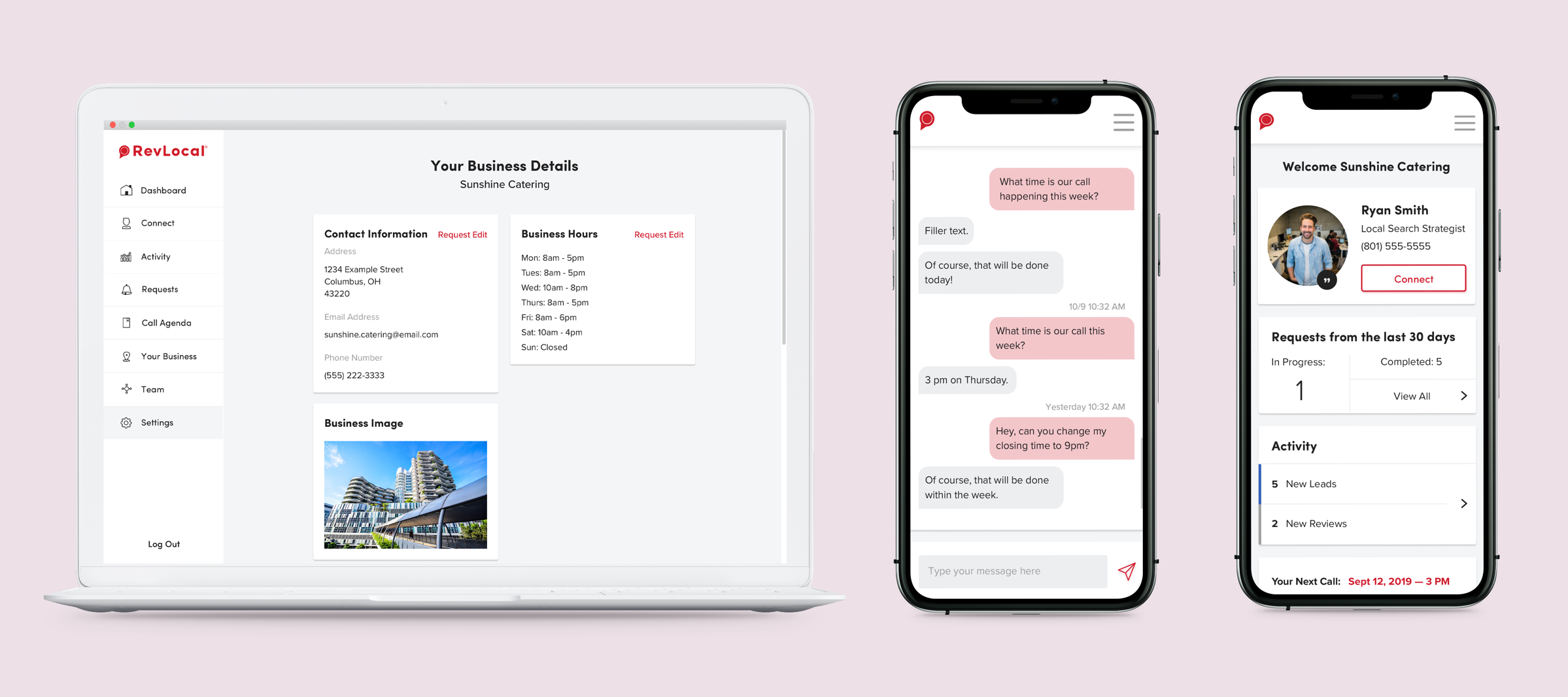
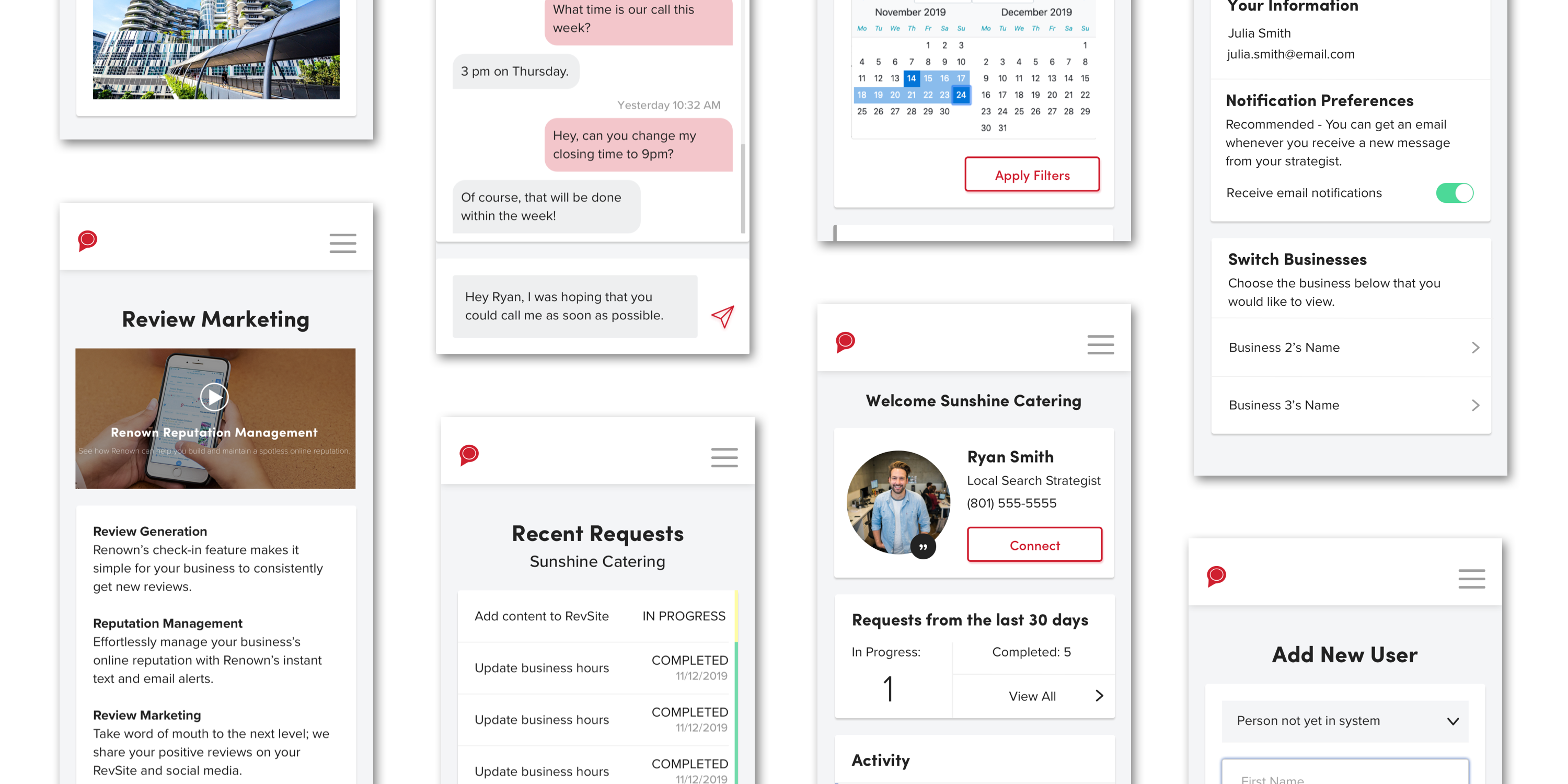
Other than the onboarding process and the navigation/dashboard, I also designed a messaging system for the user to interact with their strategist, a way to view and manage all of the requests that a user has made, an editable page with all of their business information, a screen to view plans they’ve subscribed to and add more, and the ability to invite or remove members of the user’s team to the system.
Clickable Prototype
Once a screen design for a feature was fully completed, I linked everything together in a clickable prototype that I kept adding to throughout the project.
This allowed not only RevLocal, but also our internal AWH developers to get a feel for how everything in the site should interact and what a user could expect. Developers were able to inspect the screens and get exact values and placement while RevLocal could demonstrate to any stakeholders what this product would be.
At the end of this project, I had 54 screens linked in our prototyping software, InVision.
Collaboration
I had many meetings over the months that we worked on this to ensure that what was built was exactly what RevLocal wanted. This included UX/UI review screenshares with RevLocal before screens were approved and UX reviews with AWH developers after screens were built to see if any changes needed to be made to code.
Because of its magnitude, every person on this project learned so much about not only how to be better at their own job, but also about how to collaborate effectively between two large teams. The product we ended with is one we can all be proud of.